
Color Schemes for Interiors: A Beginner’s Guide
Choosing the right color schemes for interiors can transform your living space from drab to fab. It’s a crucial element in interior design, impacting mood, functionality, and overall aesthetic appeal. Understanding the basics of color theory and how different colors interact can feel overwhelming, but it doesn’t have to be. This comprehensive guide, brought to you by cartlab.web.id, will walk you through the essential principles, helping you create a harmonious and stylish home. We’ll explore various color schemes for interiors, offering practical tips and inspiration to guide your design journey. Whether you’re renovating your entire house or simply refreshing a single room, mastering color schemes for interiors is a skill that will significantly enhance your living experience.
Interior design is a deeply personal journey, reflecting your unique style and preferences. However, understanding the foundational principles of color theory provides a solid framework upon which to build your creative vision. This guide aims to equip you with the knowledge and confidence to confidently navigate the world of color, transforming your house into a home that truly reflects your personality and enhances your well-being. We’ll explore a range of options, from bold and vibrant palettes to calming and serene schemes, ensuring there’s something to inspire every taste.
Understanding the Color Wheel: The Foundation of Interior Design

Before diving into specific color schemes for interiors, it’s essential to grasp the basics of the color wheel. The color wheel is a visual representation of colors arranged according to their chromatic relationships. It typically features primary colors (red, yellow, and blue), which cannot be created by mixing other colors. These primary colors are then combined to create secondary colors (orange, green, and violet). Further mixing creates tertiary colors, resulting in a wider range of hues. Understanding the color wheel allows you to predict how colors will interact and create harmonious or contrasting effects in your interior design.
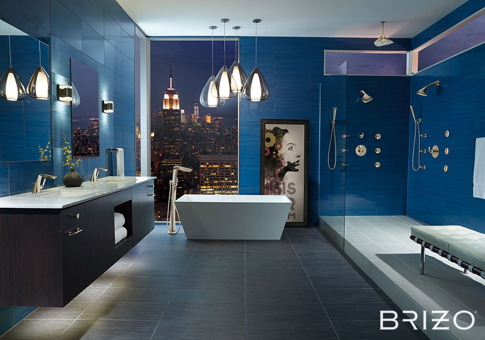
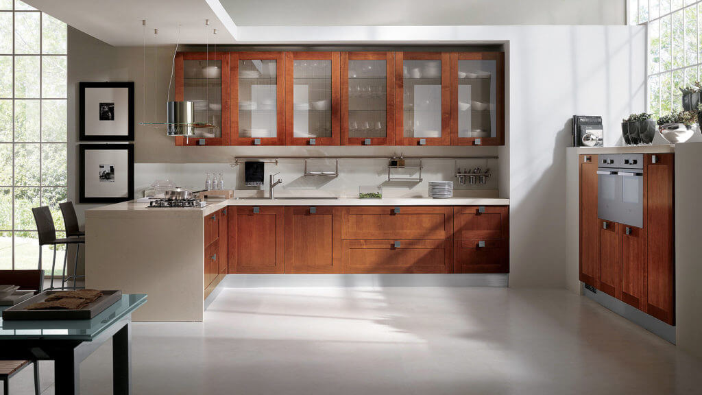
The color wheel also helps us understand color temperature. Warm colors, such as reds, oranges, and yellows, evoke feelings of warmth, energy, and comfort. They are often used in living rooms and dining areas to create a welcoming atmosphere. Cool colors, such as blues, greens, and purples, on the other hand, tend to feel calming, serene, and relaxing. They are frequently chosen for bedrooms and bathrooms to promote relaxation and tranquility. By understanding these temperature differences, you can strategically use color to influence the mood and functionality of each room.
Choosing colors wisely involves considering the existing light in a room. A north-facing room with limited sunlight might benefit from warmer colors to create a brighter and more inviting space. Conversely, a south-facing room that receives abundant sunlight might be better suited to cool colors to prevent it from feeling too overwhelming. This careful consideration of light and color temperature is crucial for creating a balanced and aesthetically pleasing environment. Remember to always test paint samples in the actual room at different times of the day to get the most accurate representation of the final color.
Monochromatic Color Schemes: The Elegance of One Hue

Monochromatic color schemes for interiors utilize different shades, tints, and tones of a single color. This approach creates a sense of unity and sophistication, perfect for those seeking a calm and cohesive aesthetic. The key to success with a monochromatic scheme lies in varying the saturation and value of your chosen hue. For instance, a monochromatic blue scheme might incorporate a deep navy blue for the walls, a lighter sky blue for the furniture, and a pale aqua for accents.
Here’s how to create a successful monochromatic scheme:
- Choose your base hue: Select a color you love and that complements the room’s function and lighting.
- Vary the saturation: Introduce both lighter and darker shades of your chosen color to add depth and visual interest.
- Incorporate textures: Use different textures to add visual interest, as the color palette is limited. Think plush velvet fabrics alongside smooth linen.
- Add subtle contrasting elements: While staying within the same color family, introduce subtle contrasting elements like metallic accents or natural wood to prevent the scheme from feeling monotonous.
Analogous Color Schemes: Harmonious Neighbors on the Color Wheel

Analogous color schemes for interiors utilize colors that are adjacent to each other on the color wheel. These schemes are inherently harmonious, creating a sense of calm and balance. They are often described as visually pleasing and easy on the eye, making them a popular choice for living rooms, bedrooms, and other spaces where relaxation is key. For example, a combination of blues, greens, and teal creates a serene and refreshing atmosphere. Similarly, yellows, oranges, and reds can generate a warm and inviting space.
Creating an effective analogous scheme involves:
- Choosing a dominant color: Select one color as the primary focus and use its neighbors as supporting colors.
- Varying intensity: Use different shades and tints of each color to prevent the scheme from looking flat.
- Using accents: Introduce a neutral color like white, beige, or gray to balance the scheme and provide visual breathing room.
- Considering the room’s function: Analogous schemes work well in spaces where you want to create a calming and harmonious ambiance.
Complementary Color Schemes: Vibrant Contrasts
Complementary color schemes for interiors involve using colors that are directly opposite each other on the color wheel. These combinations, such as red and green or blue and orange, create a vibrant and energetic contrast. While they offer a bold and striking visual impact, they require careful planning to avoid overwhelming the space. Using one color as a dominant shade and the other as an accent is a common strategy.
Tips for using complementary schemes effectively:
- Dominant and accent colors: Choose one color as the dominant shade for larger surfaces (walls, furniture) and the other as an accent for smaller elements (accessories, artwork).
- Balance is key: Ensure the ratio of dominant to accent color creates a balanced and visually appealing space, preventing one color from overpowering the other.
- Neutral tones: Introduce neutral tones like beige, gray, or white to soften the contrast and provide a sense of equilibrium.
- Consider the room’s size: Complementary schemes can feel intense in smaller rooms, so consider using muted versions of the colors or incorporating more neutral tones.
Triadic Color Schemes: Balanced Harmony with Three Colors

Triadic color schemes for interiors utilize three colors evenly spaced on the color wheel, such as red, yellow, and blue. This approach creates a vibrant and balanced palette, offering a greater variety than analogous or monochromatic schemes. A triadic scheme can be both bold and harmonious, depending on the specific colors chosen and their intensity. For example, a triadic scheme using muted versions of red, yellow, and blue will feel more subtle than one using bright, saturated shades.
To effectively use a triadic scheme:
- Choose one dominant color: Select one color to be the primary focus and use the other two as supporting colors.
- Adjust saturation: Vary the saturation of the three colors to avoid a jarring effect.
- Use neutral accents: Introduce neutral colors to help balance the scheme and prevent it from feeling too overwhelming.
- Consider texture and pattern: Varying textures and patterns can add depth and interest to a triadic scheme.
Conclusion
Mastering color schemes for interiors is a journey of exploration and experimentation. By understanding the basics of color theory and the various schemes available, you can create a living space that reflects your personality and enhances your well-being. Remember to consider the function of each room, the available natural light, and your personal preferences when making your color selections. This beginner’s guide serves as a starting point – feel free to experiment, adapt, and develop your own unique style. For further inspiration and resources, visit our website: Color Schemes for Interiors: A Beginners Guide We hope this guide has empowered you to confidently tackle your next interior design project! Remember to always consult with professionals for complex projects or if you are unsure about your choices. Happy decorating!
(Note: Remember to replace the bracketed image placeholders with actual images. Also, replace the placeholder internal links with actual links to relevant pages on cartlab.web.id. Finally, consider adding external links to reputable sources like Benjamin Moore or Sherwin-Williams color websites for further color information and inspiration.)


Comments